LewisMacdonald Posted July 20, 2009 Report Share Posted July 20, 2009 just read this on the OS. " Saints players Murray Davidson and Graham Davidson parade the new strips " When did we sign him? Is he the Swedish trialist? that's graham gartland???? Quote Link to comment Share on other sites More sharing options...
Aitchy Posted July 20, 2009 Report Share Posted July 20, 2009 C'mon, people are being ridiculous now! Number 1 its hardly the worst football top ever designed. Also do you really think they havent designed the patch on the back with the players names in mind, it appeared to work perfectly well for united in the past few years: In my opinion we have gone for a good kit maker and also have utilised the double sponsor idea and have come out of it with an average but acceptable football strip. Cheer up, we're the fcukin champs!!!!!! At last some sense, typical over reaction on this forum. Quote Link to comment Share on other sites More sharing options...
HertsSaintee Posted July 20, 2009 Report Share Posted July 20, 2009 Can I buck the trend here and say that I actually quite like the new kit. Nice and simple. Unfussy with no irrelevant fancy squigly bits, the way a football shirt should be. Like the gold trim too - makes it a bit different in a classy sort of way. OK, the logo is a bit naff with the oval background, but hey, at least we're not all sporting the word "Bonar"... The away shirt? When did Gartland join Hearts? Quote Link to comment Share on other sites More sharing options...
MySpazz Posted July 20, 2009 Report Share Posted July 20, 2009 CORPORATE DROSS - DRONES Andy Wyles, Divisional Managing Director for Taylor Wimpey in Scotland said: “We’re more than happy to extend our agreement for a further season with St Johnstone FC, and would like to congratulate everyone involved on a very successful year for the Club so far. Clearly this is an important year in the club’s history, and we wish them every success in their efforts in the SPL this year. “Our association with St Johnstone FC and our renewed commitment for a further year allows Taylor Wimpey to play a part within the local community in Perthshire, whilst also raising the profile of the new Taylor Wimpey brand.” PROPER FANS - HUMAN Darren McDermott, Managing Director of Easy Heat systems, enthused “I am delighted to be associated with St Johnstone in this official way. As a company we have long supported the club and I believe the football club adds considerably to the feel good factor in the community and the reputation of the City of Perth. All of us at east Heat Systems are proud to be part of the success of St Johnstone and wish them well in the season ahead.” Quote Link to comment Share on other sites More sharing options...
R.B.B:- Adz Posted July 20, 2009 Report Share Posted July 20, 2009 OK, the logo is a bit naff with the oval background, but hey, at least we're not all sporting the word "Bonar"... Or wearing Dark Blue, Tangerine or Green and white hoops Quote Link to comment Share on other sites More sharing options...
john1962 Posted July 20, 2009 Report Share Posted July 20, 2009 I don't think Saints were in a postion to argue about the sponsor's logo. If that is how the sponsor wants it Saints are in no position to turn it down in this financial climate. Quote Link to comment Share on other sites More sharing options...
myDarlingBeefeater Posted July 20, 2009 Report Share Posted July 20, 2009 Heres it on the official website http://www.perthstjohnstonefc.co.uk/newsitemsdetail.php?param=436 Nice to see Neighbours' Paul Robinson modeling our new away strip. I quite like the home top and don't mind having a rear shirt sponsor. Have to agree with the consensus about the Taylor Wimpy logo though - really cheap and tacky looking. Just think of the money Quote Link to comment Share on other sites More sharing options...
GazNicolson Posted July 20, 2009 Report Share Posted July 20, 2009 this is not bad apart from the big logo.if you want a mingin football shirt take a look at celtics new away strip ! not liking the photograph though id actually like to see the full strips ! Quote Link to comment Share on other sites More sharing options...
only1sammiller Posted July 20, 2009 Report Share Posted July 20, 2009 for a start, at least its blue. the away top is actually pretty smart, really like the shorts. so what if it has a big sponsor?? is it that much a big deal?? look back at threads for previous kit releases. we moan every year. if the sponsor is a big deal stick your top in the wash 3 times and it'll fall off anyway Quote Link to comment Share on other sites More sharing options...
only1sammiller Posted July 20, 2009 Report Share Posted July 20, 2009 absolutely minging. Much worse than anticipated. Lets get them to change it. Fan power campaign anyone? Digital petition? Lets rise as one and do something about it. get a grip Quote Link to comment Share on other sites More sharing options...
208saint Posted July 20, 2009 Report Share Posted July 20, 2009 Anybody else reckon the socks aren't ready yet? Quote Link to comment Share on other sites More sharing options...
WilliePullar Posted July 20, 2009 Report Share Posted July 20, 2009 Absolutely minging. Much worse than anticipated. Lets get them to change it. Fan power campaign anyone? Digital petition? Lets rise as one and do something about it. How about you get a life? Quote Link to comment Share on other sites More sharing options...
TheBigCheese Posted July 20, 2009 Report Share Posted July 20, 2009 Totally bowffing effort that would look crap on a Sunday league team. Quote Link to comment Share on other sites More sharing options...
Havana Club Saintee Posted July 20, 2009 Report Share Posted July 20, 2009 Nice couple of strips. Hope the quality improves this season, however that sponsor looks cheap and nasty and after a dozen washes I think this will disappear off my son's kit. I really hope I am wrong. COME ON YE SAINTS Quote Link to comment Share on other sites More sharing options...
garydavidson Posted July 20, 2009 Report Share Posted July 20, 2009 lets hope the logos come off easily they look totally gash an spoil an otherwise nice top. Quote Link to comment Share on other sites More sharing options...
Lincolnshire no More Posted July 20, 2009 Report Share Posted July 20, 2009 I don't think Saints were in a postion to argue about the sponsor's logo. If that is how the sponsor wants it Saints are in no position to turn it down in this financial climate. Its a business deal for the sponsor. If they want the logo on the shirts the club should be able reach a compromise with the aid on a designer on how it looks. But no doubt the club are at least reasonably happy with how the shirt looks. Perhaps this is the best design of a bad bunch? Quote Link to comment Share on other sites More sharing options...
Zimmerman Posted July 20, 2009 Report Share Posted July 20, 2009 Strips generally always look better in the flesh than on the site. However, these do look pretty nasty! Home top lookS alright, but the sponsor is pretty embarassing to be honest. Looks like a 5 year found paint on the windows menu. It's funny when the flash of last year's strip comes on the site and looks ten times better. The elipse is pretty naff, should have went for a bordered stroke round the sponsors name, like last year. I find it hard to believe the sponsor was pleased with that comparing it to last year. Maroon top looks suspect as well. I'm sure they will look better in real life. If sheerin crosses the ball in and it hits deuchars wimpey bulls eye elipse and goes in on the opening day, the sponsor is the last thing I will be thinking about. Incidently, why is it when you load up the site every year to find the new strip, you feel less attached to the team if the strip is naff?? ha ha! It has taken me all of 10 mins to get over it. MON THE SAINTS!!!!! Quote Link to comment Share on other sites More sharing options...
john1962 Posted July 20, 2009 Report Share Posted July 20, 2009 Its a business deal for the sponsor. If they want the logo on the shirts the club should be able reach a compromise with the aid on a designer on how it looks. But no doubt the club are at least reasonably happy with how the shirt looks. Perhaps this is the best design of a bad bunch? But as has been said elsewhere if it's the company logo it becomes a take it or leave it for Saints Quote Link to comment Share on other sites More sharing options...
faircityboy Posted July 20, 2009 Report Share Posted July 20, 2009 Nice to see Neighbours' Paul Robinson modeling our new away strip. timmy mallet to the left.they guys must be huge GB looks like he is a dwarf Quote Link to comment Share on other sites More sharing options...
metalbearabroad Posted July 20, 2009 Report Share Posted July 20, 2009 How about you get a life? get a grip It was...... SARCASM Jesus, some people really need a smilely in order to pick up nuance...... The strip is horrible, but I don't really care. Not buying it anyway. Quote Link to comment Share on other sites More sharing options...
geoff was right!! Posted July 20, 2009 Report Share Posted July 20, 2009 But as has been said elsewhere if it's the company logo it becomes a take it or leave it for Saints Going by their website, their logo is only 1 line, so why make it 2 on the strip? http://www.taylorwimpey.com/home Quote Link to comment Share on other sites More sharing options...
Saintly Child Posted July 20, 2009 Report Share Posted July 20, 2009 Why can't saints get a simple thing right? Thats a crap design and logo will stop people buying it. Thus Saints losing money. The fans must decide the design in future. Quote Link to comment Share on other sites More sharing options...
john1962 Posted July 20, 2009 Report Share Posted July 20, 2009 Going by their website, their logo is only 1 line, so why make it 2 on the strip? http://www.taylorwimpey.com/home Because it would then go all the way across and look even worse. Quote Link to comment Share on other sites More sharing options...
john1962 Posted July 20, 2009 Report Share Posted July 20, 2009 The fans must decide the design in future. I think you can forget that, the club is not a democracy! Quote Link to comment Share on other sites More sharing options...
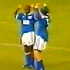
sainteesrule Posted July 20, 2009 Report Share Posted July 20, 2009 (edited) I like it much more now than i did initially! Hopefully names and numbers will be gold - add SHEERIN 11 and you've got yourself a peach of a top! Anyone remember what position we finished last time we had a big steaky white blob on the front??? http://news.bbc.co.uk/olmedia/1100000/images/_1101095_georgeoboyle300.jpg Edited July 20, 2009 by sainteesrule add pic Quote Link to comment Share on other sites More sharing options...


Recommended Posts
Join the conversation
You can post now and register later. If you have an account, sign in now to post with your account.